Prime Highlights:
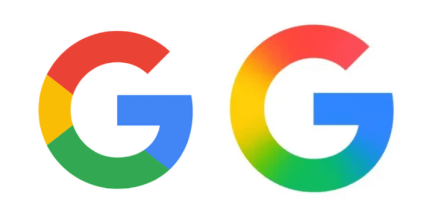
- Google rolls out a fresh ‘G’ logo in the form of a gradient, its first visual redesign since 2015.
- The overhaul positions the brand in line with its current AI-driven persona, such as Gemini.
Key Facts:
- The new logo effortlessly flows from Google’s classic red, yellow, green, and blue.
- The overhaul creates a shared visual look across AI services.
- The redesign is now apparent on the Google app for Pixel phones and iOS.
Key Background :
Google has refreshed its iconic ‘G’ logo, going with a leaner, more sleek gradient aesthetic that signals the business’s further drift towards artificial intelligence and modern design. The new logo reunites its traditional four colors—red, yellow, green, and blue—in a sleek gradient, eliminating the previous logo’s more fractured bands of color. It is the biggest redesign of the logo since 2015.
The transformation is not superficial; it’s a directional visual change. Google has, in the past, aimed to unify and streamline its brand presence across the media. The gradient aesthetic of the new ‘G’ logo reminds one of that of its AI-powered assistant, Gemini, and other AI-based products, hinting at Google’s emphasis on embedding AI into the essence of its product experience.
When the iconic ‘G’ logo was updated in 2015, it substituted the complete serif “Google” wordmark with a fresh new sans-serif look and included the multicolor ‘G’ for improved fit on the mobile and small-screen platforms. That is one of the aspects of the general rebranding by Google under the restructuring of Alphabet Inc. The new gradient refresh maintains this evolution, introducing the brand with a new, sleeker appearance consistent with the design style of modern tech. Currently, users are now able to view the new gradient ‘G’ logo within the Google app on iOS and Pixel. Gradual rollout of the logo to the rest of Google’s platforms and services will be in the pipeline in the coming weeks.
This modest visual tweak, a glimpse of what will increasingly permeate everywhere, is fine-tuning design on steroids—albeit just the beginning for the company’s next era, which will be defined by even more advanced AI-driven experiences, simplified interfaces, and converged branding. It is also a reflection of Google’s intent to animate its products further and integrate them further in a continually changing digital environment.
Finally, the new logo is a modest but significant move—showing that even minor adjustments may presage seismic change of direction for a technology-aware business.


